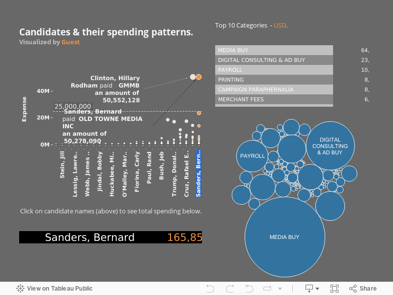
Click on Names or Orange circles below - to view 2016 US presidential elections candidates spending patterns. Orange circles stand for specific vendor/partner transactions/groups. The bubble chart and the tabular categorize them by volume and numerical ordered by volume.
US Presidential Elections 2016 - Spending Patterns.
Storytelling and dashboarding allow us to consume expensive computations and provide ROI.
For advanced computations - Netezza, Teradata and Tableau implementation, reach out to us to know more about dashboarding/ hierarchy of users and more advanced design principles.
Sphinxbi Inc
SphinxBI © ALL RIGHTS RESERVED.
+1.5136802815